Hello crafty friends,
Welcome to another clean and simple card project. This card is inspired by the beautiful colors and thoughts that Stephanie Klauck shared in her AECP class -In the Mood for Colors.
On this day I was inspired by reds and pinks. I love the red wild roses in my garden. As we approach the cooler weather, I wanted to cherish them and their reds and pinks a little longer.
PRODUCT LINKS CONTAIN COMPENSATED AFFILIATE LINKS AT NO COST

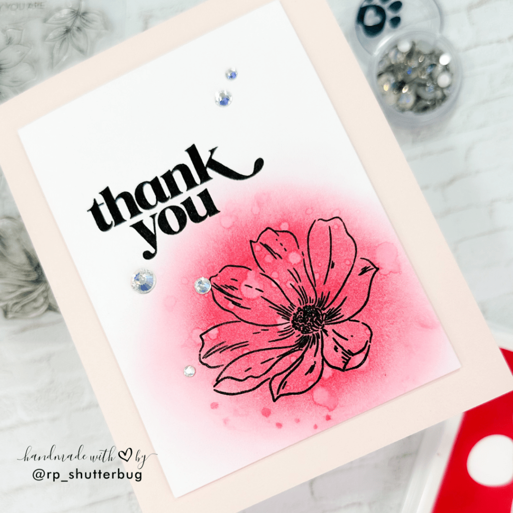
To begin with, I wanted to create a very clean and simple card front. I started by ink blending onto the lower left corner of my panel. I used the SSS Pawsitively Saturated Ink in the shade Cherry and with a very light hand blended the ink. I love this shade of ink, since I feel this is the perfect blend of red with a hint of dark pink.
Once I was done ink blending I added some drops of water over the ink blended area. The SSS Pawsitively Saturated Inks are saturated die inks which react with water. This gives a distressed and textured look to our background.
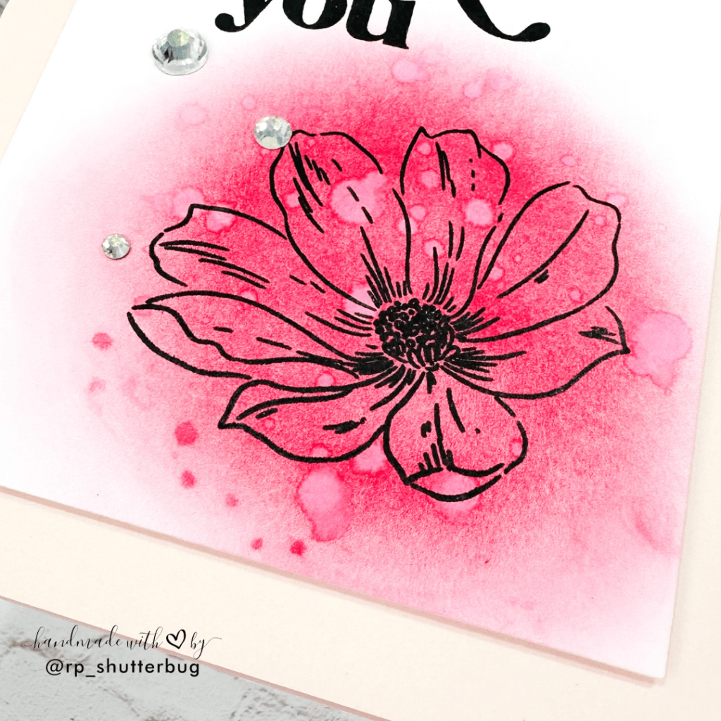
I then used this gorgeous floral image from the Perfectly Perfect Stamp Set by Altenew and stamped it over the ink blended background using VersaMark Onyx Black Ink.
Well instead of ink blending, you could go the traditional way of first stamping the image and then coloring it with some beautiful reds and pinks. But this is something that I learnt in the class where I could create an impact with just one stamped image by creating a fun textured background which I felt not just added color to our floral image but also provided a base for our focal point.
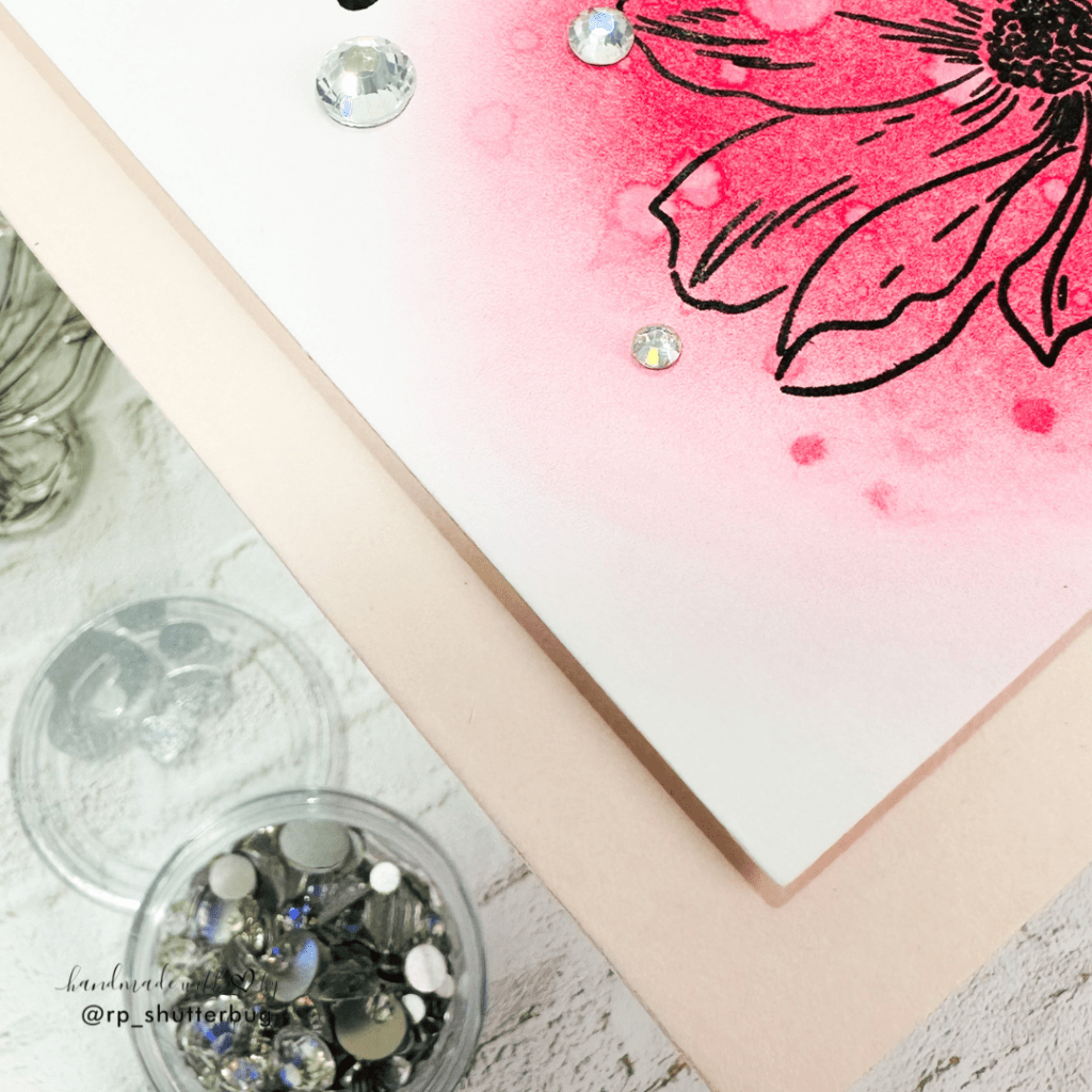
I trimmed the panel to be slightly smaller than my A2 size cardbase.
Next, I used the big bold “Thank You” sentiment from the Alluring Orchids Outline Stamp and stamped it diagonally opposite to my focal point.

For some finishing touches, I had to add some bling on this card. I used the Prism Pawsitively Dazzling Gems which is a perfect touch of sparkle that this card needed. I then adhered this panel onto a lighter shade of pink cardstock to match the pink on our focal point.
I love how this card turned out. I think I might create this in multiple other colors and turn it into a set of cards perfect as a holiday gift.
This card is an example where you don’t need complex techniques or fancy products to create beautiful cards. I learnt that even a single shade of ink and a small stamp is enough to create something gorgeous.
Also, a big thank you to the creators at Altenew for all the wonderful classes and tips and tricks to create beautiful projects.
The Altenew Educator Certification Program is definitely a best opportunity to showcase my work and get in touch with all of the amazing crafters.

Thank you for being here with me today. Do check out fun pictures and videos of the project on my Instagram page (@rp_shutterbug). Also, tag me on Instagram with pictures of your projects.
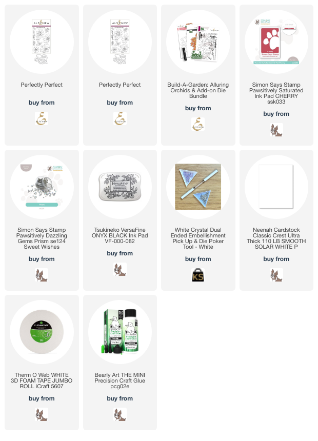
SUPPLIES:
*NOTE: Affiliate links may be used (at no additional cost to you) – thank you for your support!
 https://linkdeli.com/widget.js?id=f5e8378456858c916708
Thank you for joining me. Until next time, stay safe.


Leave a comment