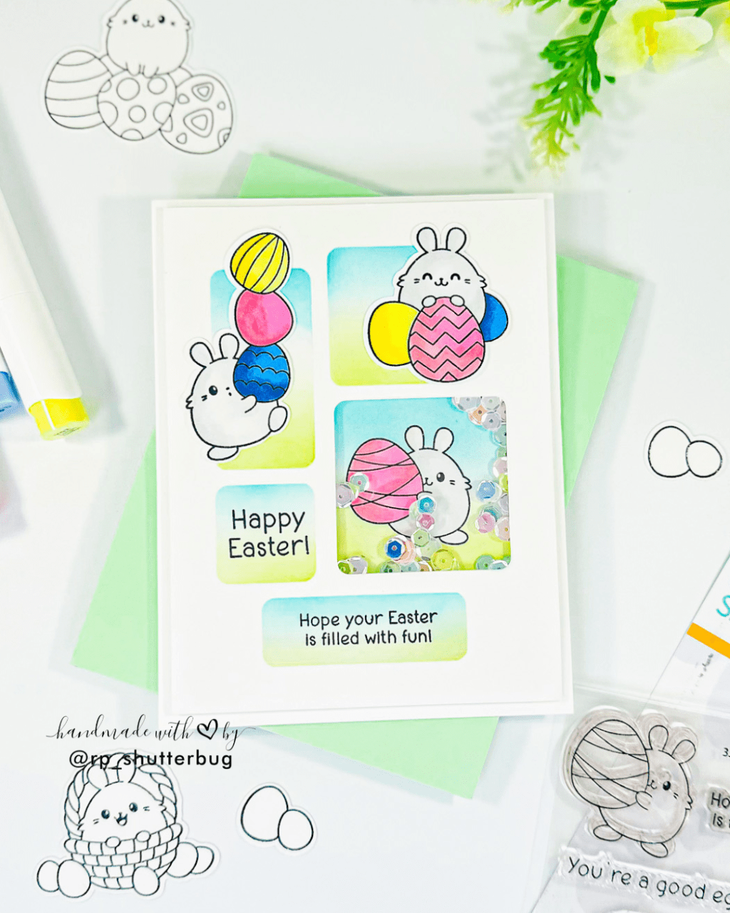
Hello crafty friends,
If you were to ask me what my favorite card-making technique is, I would definitely say the blackout technique. This technique takes embossing to a whole new level by utilizing the debossed side of an embossed panel. It’s a fantastic way to add color quickly, whether you’re ink-blending, watercoloring, or, as I often do, using alcohol markers to create bold, eye-catching focal points. In today’s post, I’m excited to show you how this technique works and why it’s become a staple in my card-making projects!
Today, I’ve created two cards. The first features a recreation of a previous project using the Brilliant Budding Floral Embossing Folder, while the second showcases some fun rainbow-colored butterflies. For both cards, I colored the debossed side of the embossed panels with my Spectrum Noir Tri Blend Markers. Then, using a darker shade, I swiped the ink pad across the colored panel to achieve the blackout effect.
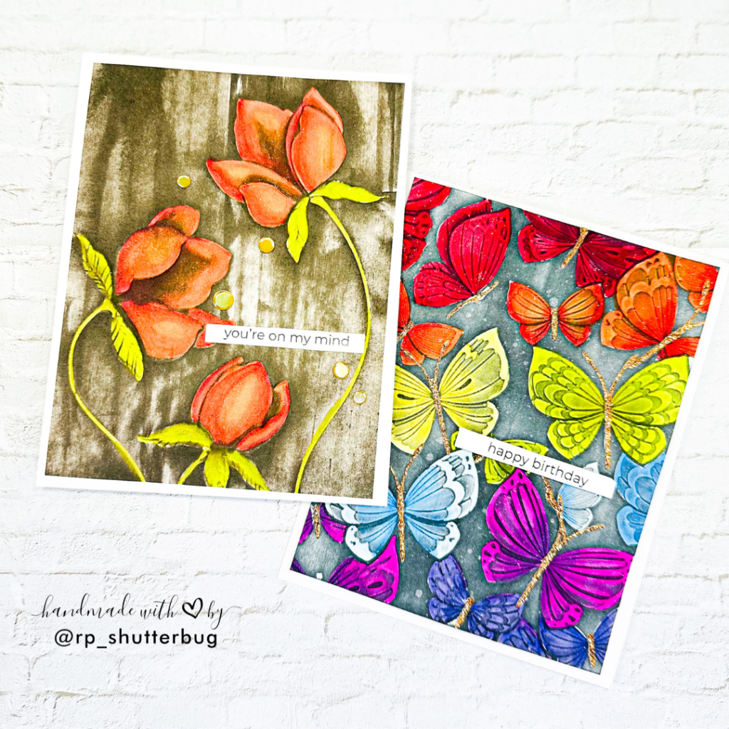
Card #1

For today’s card, I’m using the Brilliant Budding Floral Embossing Folder, which comes with a coordinating die to cut out one of the flowers. However, for this card, I’m sticking with just the embossing folder to create a beautiful, textured background.
Before running the paper and embossing folder sandwich through my die cutting machine, I like to mist the paper lightly with water. This step loosens the paper fibers and helps prevent any tearing or cracking, giving me a smoother, more durable result.
Once the panel was embossed, I turned it over to the debossed side and began coloring the flowers in stunning orange shades. I love using the Spectrum Noir Tri Blend Markers for these types of projects, as each marker includes three different shades of the same color, which makes adding depth and shadow a breeze. No need to search for matching shades! I added vibrant greens to the leaves and stems to balance the warm tones of the flowers.

After coloring all the debossed images, I added the finishing touch—creating the blackout effect. To do this, I swiped my ink pad across the panel, ensuring that only the raised areas of the embossing were covered. For this card, I used SSS Pawsitively Saturated Ink in the shade Woodsy, a rich dark brown that complemented the orange tones of the flowers perfectly.
To complete the card, I die cut a simple sentiment from the SSS Everyday EZ Strips set, keeping it clean and elegant. As a final touch, I added some Gold Hologram Sequins from This Calls For Confetti to give the card a bit of sparkle and shine.
I’m really pleased with how this card turned out! The blackout effect with the vibrant colors and simple sentiment creates a striking design, and the sequins add just the right amount of glimmer.
Check out my YouTube channel to watch how I bring this card to life, where I walk you through all the coloring and techniques I used to create it!
Card #2

For this card, I used the Fantasy Butterflies Embossing Folder, which also comes with coordinating dies that I’ll be using later to complete the look. This embossing folder is perfect for creating an intricate, butterfly-filled background that adds so much texture and detail to your card design.
I started by embossing a white A2-sized cardstock panel with this gorgeous butterfly pattern. The level of detail in the design is truly stunning, and I decided to go all in with some vibrant rainbow colors. Of course, you could easily use a single color palette if you’re aiming for a more subtle effect, but the rainbow shades really bring the butterflies to life!
After finishing the coloring on the debossed side, I wanted to add a bit more depth and detail. I swiped SSS Pawsitively Saturated Ink in the shade Charcoal across the embossed areas. The dark ink creates a whimsical blackish hue that really enhances the wings of the butterflies, giving them a beautiful and striking contrast against the vibrant colors.

Next, I cut out the centers of each butterfly using some glitter cardstock from Your Paper Insider. This added just the right amount of sparkle and shine to the design, making each butterfly stand out even more.
To complete the card, I misted the entire panel with some sparkly silver shimmer mist, giving it a soft, elegant shine. For the sentiment, I used a simple, yet bold, phrase from the SSS Everyday EZ Strips set, which worked perfectly with the colorful butterflies.
I’m so pleased with how this card turned out. The combination of bright colors, the whimsical charcoal ink, the glittery butterfly centers, and the final touch of shimmer mist make this card feel lively and full of energy. It’s a design that’s sure to brighten anyone’s day!
Don’t forget to check out my Instagram profile (@rp_shutterbug) where I share a ton of inspirations and fun projects.
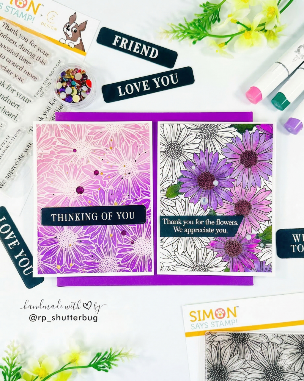
SUPPLIES:
*NOTE: Affiliate links may be used (at no additional cost to you) – thank you for your support!
 https://linkdeli.com/widget.js?id=f5e8378456858c916708
Thank you again for joining me today. Until next time, stay safe.


Leave a comment