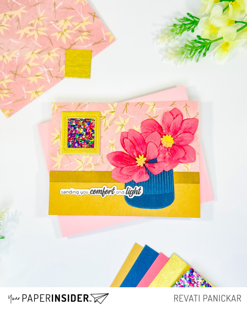
Today, I’m so excited to share a vibrant and colorful card that’s a little departure from my usual clean and simple (CAS) style—but one I had so much fun creating! Featuring beautiful specialty papers from Your Paper Insider, this card combines bold textures, eye-catching florals, and a heartfelt sentiment to pull it all together.

The inspiration for this card started with that stunning patterned paper in the background—White and Red Flowers Yuzenshi Paper from Your Paper Insider. With its elegant floral design, it looks almost like vintage wallpaper. The intricate details instantly caught my eye and inspired me to create a matching floral element for the front.
For the focal flower, I used the Painted Daisies Die, pairing it with Salzburg Gmund Ever Paper—a lightweight textured paper that mimics the delicate feel of flower petals. It’s subtle in pictures but adds such a soft, elegant touch in person.
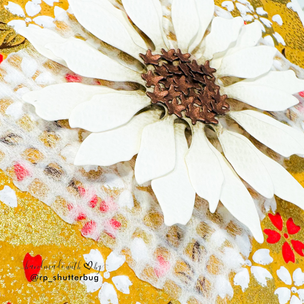
To add contrast, I cut the flower centers using Copper Curious Alchemy—a shiny, rich brown paper that pairs beautifully with the soft flower tones. The die creates tiny star shapes for the centers, and to add dimension, I placed each piece on the foam pad from my Sizzix Die Brush & Die Pick Accessory Kit. I gently pressed into them using the tip of the Sizzix Intricate Craft Tool, creating a textured, almost sculpted look.
I layered the two flower die cuts using foam tape for added depth and adhered the centers with the Simon Says Stamp Pawsitively Perfect Craft Glue—my new favorite!
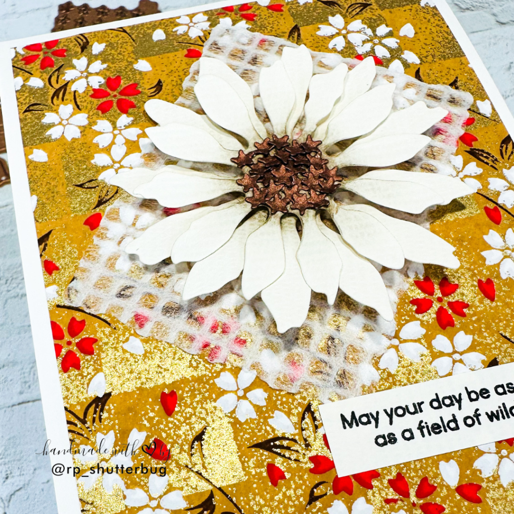
Before placing the flower on that bold background, I felt it needed a neutral matte layer to make it stand out. While I initially reached for vellum, I ended up using the White Grid Watermark Rayon Sheet from YPI instead. I die cut it using the Deckled Rectangle Dies by Spellbinders, and it was the perfect choice to ground the flower without taking away from the background.
Once everything was in place, I assembled all the elements to build the card front.
For the sentiment, I chose a heartfelt phrase from the Sunflower Garden Stamp Set by Simon Says Stamp. Its font and tone complemented the rest of the card beautifully.
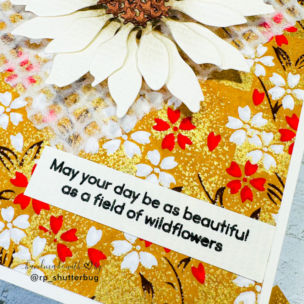
To finish it off, I mounted the card front onto a light white cardstock base by Sizzix—not my usual bright white, but one that blended seamlessly with the tones of the card.
I love how bright, bold, and cheerful this card turned out to be! It’s definitely a step away from my typical CAS style, but it felt so freeing to play with color, texture, and layers. The combination of specialty papers and delicate die-cuts made this design come alive, and I can’t wait to experiment more with these beautiful materials from Your Paper Insider.

Also, don’t forget to check out my Instagram profile (@rp_shutterbug) where I share a ton of inspirations and fun projects.
SUPPLIES:
*NOTE: Affiliate links may be used (at no additional cost to you) – thank you for your support!
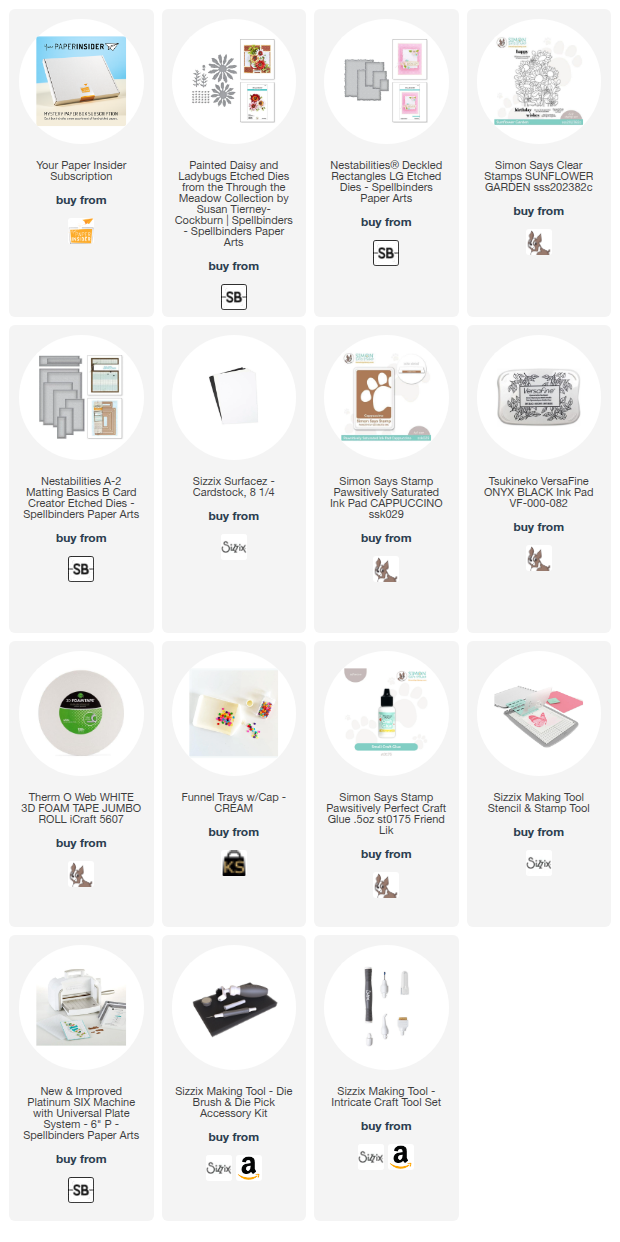 https://linkdeli.com/widget.js?id=f5e8378456858c916708
Thank you gain for joining me. Until next time, stay safe!

Leave a comment