Hello crafty friends,
I am so happy to share with all you lovely people, I finally made it through my Altenew Educator Certification Program (AECP) Level 2. It was so much fun and learning journey. I am here sharing 4 Masculine Cards as part of the Level 2 final challenge.
This is part 1 of a 2-part assignment where I have created a set of 4 Masculine Cards combining a few techniques that I learnt in my level 2 courses.
Before we take a look at the projects, let me take a minute to talk about some of the ground rules for the assignment.
- Select ANY 3 components from the classes in Level 1 or 2 (e.g., layering 1/2, Let it shine, stencil techniques)
- Explain the 3 components that you’ve chosen for the project
- Share design tips (if any)
- Please make 4 MASCULINE cards (Themes are; birthday, Love/Thinking of You, Anniversary, and Encouragement)+ Altered Item/Upcycled Project.
- Challenge blog post: Detailed step-by-step photo tutorial and/or YouTube video
- Minimum of 10 photos (close-up and process)
It was really a tough choice to select just 3 components for a bunch of really amazing techniques, that were taught through Level 1 and 2. The classes had so many fun design ideas, tip and tricks, beautiful color combinations, that it was so difficult to pick just 3 of those ideas for my cards. Also, if you know my crafty style, you know that I am more of a floral girl. Creating masculine cards was definitely a challenge for me.
Listed below are some of the many lessons that I used to create these cards. (P.s., for all my projects, I have to thank my husband who has been my true inspiration and a solid support system. Every card I shared here, not only has details about my techniques, but also has a small story behind it.)
- Color Your Day / In the Mood For Color – The first choice that I had set in my mind was the color scheme for all the cards that I planned on creating for this assignment, and that was Blue. I combined tips and tricks from both Color Your Day and In the Mood for Color classes, to be inspired by the mood and colors around me. Blue for me represents calmness. It symbolizes the deep sky and ocean. Something that I get a lot from my husband! I implemented this color scheme on all of the cards. I wanted to add some contrast with along with the blue, so you will see me using grays, whites and even gold embossing powder.
- Ink Blending Techniques – Ever since I started my cardmaking journey, ink blending has been a very important part of this journey. Be it creating beautiful ink blended backgrounds or small ink blended focal points, I have always loved this technique. As you scroll through this post, you will find some fun Ink Blending Techniques that I learnt during the sessions with AECP. I have created a scene, used inks on stencils, added just a hint of color and used ink on a makeshift stencil too.
- Beyond Basic Backgrounds – All the cards, though very clean and simple have some striking feature on their backgrounds, which helps pop up my cards. I have a partially inked background, well spaced stenciled background, a fun floral focal point and cute scene with a textured background and a little heart!
Let’s take a look at the set of cards that I have created for this assignment and then I will talk about each card in detail.
You will notice that I kept the color and basic design of these cards same and used very limited products to create my cards. I did mix in a little floral design on one of the cards, hope the guys don’t mind 😉
Let’s now take a closer look at each card.
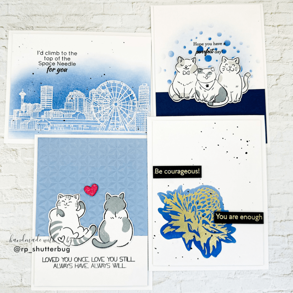
Card #1 – Love / Thinking of you

I started by stamping the Sketchy Cities of America 2 Stamp Set which shows the skyline of beautiful Seattle. This was the first stamp set that I purchased from Altenew when I moved to Seattle, so it holds a very special place in my heart! I am not sure if this is still available in the store though, but like I mentioned, this is a very special stamp and I had to use it for my final challenge.
I stamped the sky line onto an A2 size white card stock, using clear embossing ink and added some white embossing powder over the stamped image.
TIP when heat embossing onto a cardstock panel – make sure your heat gun is very hot. I usually give it a minute or even more to heat up, before I bring it on my paper, specially when the image is so intricate. Also, don’t focus all the heat in place. Keep moving your heat gun over the entire panel. This will ensure that the paper doesn’t warp and bend.
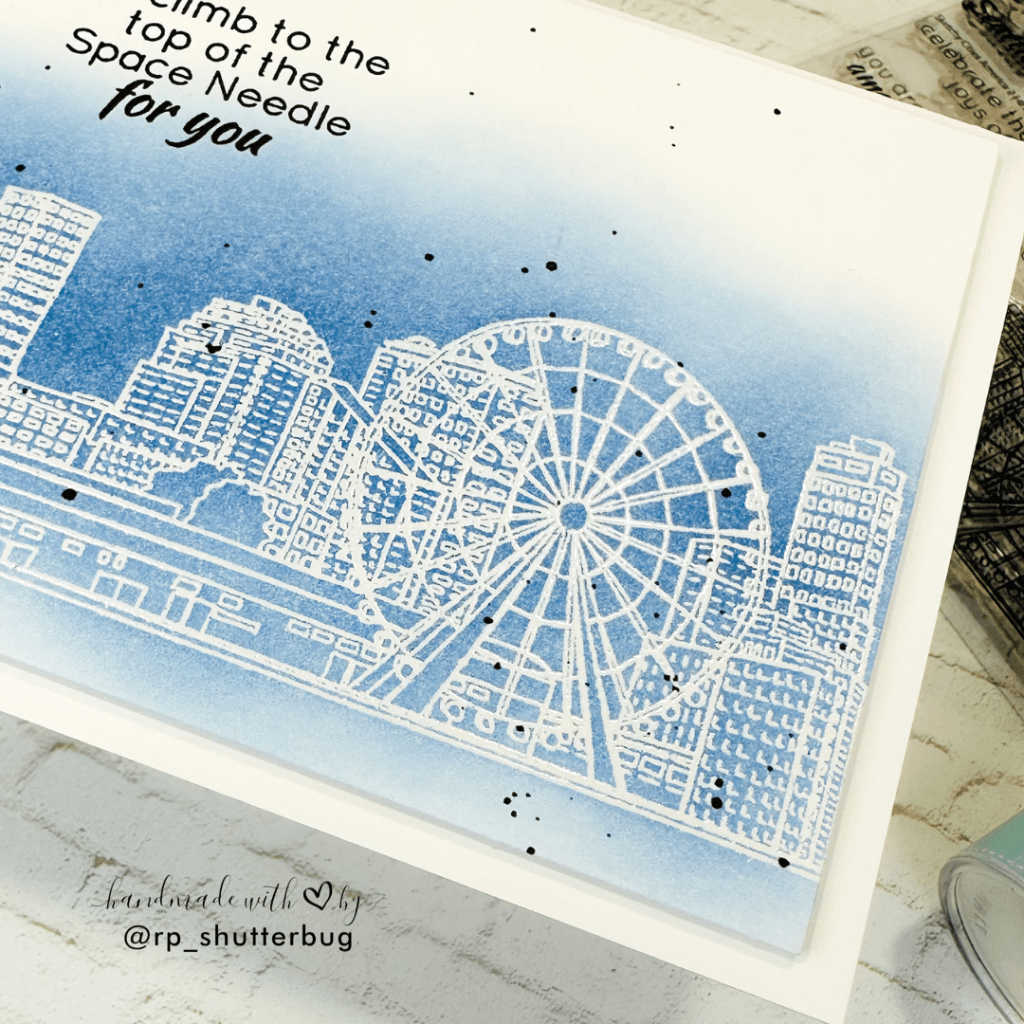
I did an emboss resist technique for this panel. Over the embossed stamped image, I ink blended some beautiful blue shades of inks. The best part about ink blending over the embossed image is that the embossing will resist all of the color and white embossed image will show through the beautiful color in the background.
I didn’t add ink all over the card panel, instead focused around our skyline!
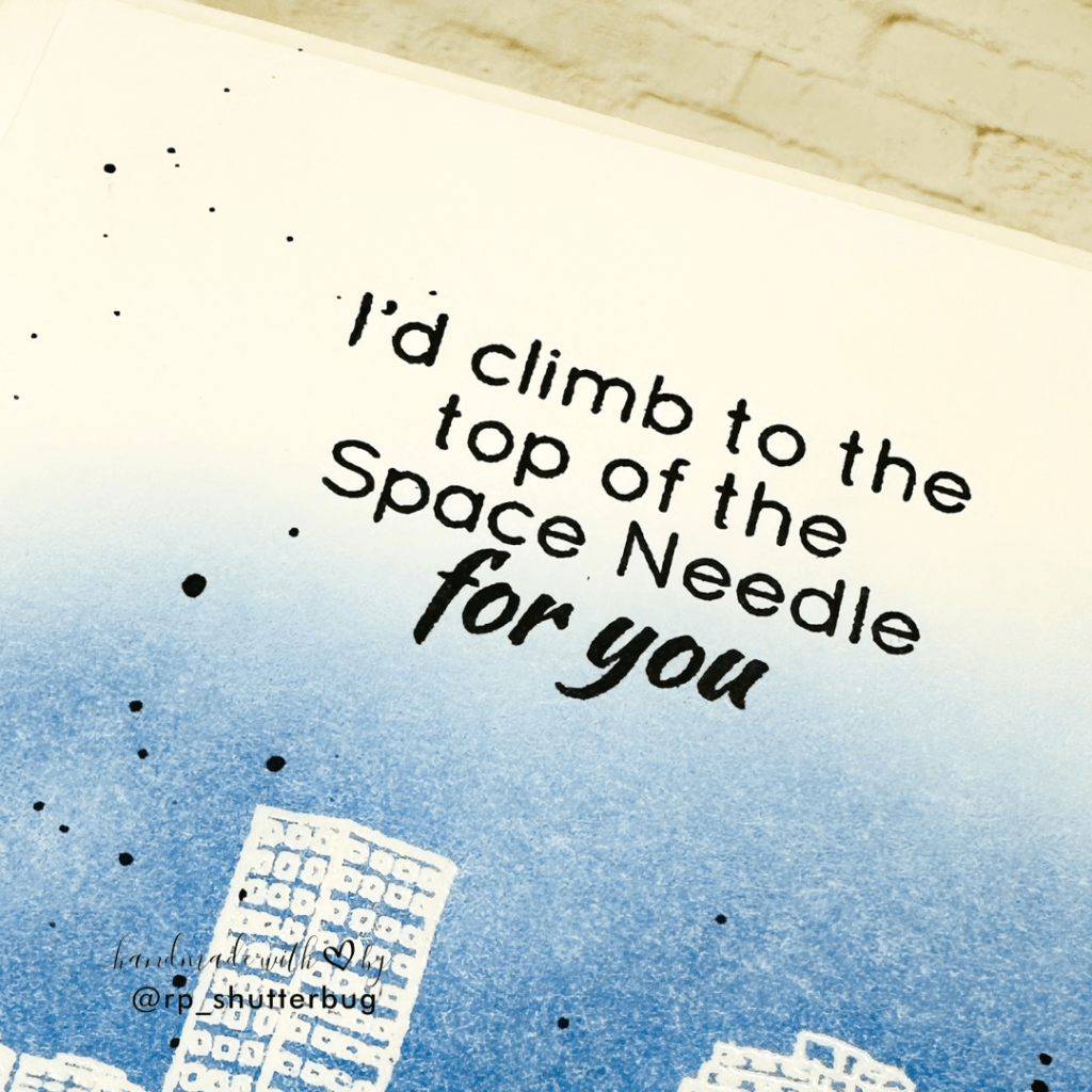
Next I stamped my sentiment “I’d climb to the top of the Space Needle for you” which I thought matched perfectly not just with our Seattle skyline but also the theme of this card. The Space Needle is more than just a building to every Seattleite I guess 😉
This is a little note we all need at sometimes, to express how deeply we love our dear ones and that they will always be in our thoughts 🥰

I love shine and sparkle on my cards. I try to use sequin mixes or metallic gold splatters but with masculine card I had to get a little creative with my shines. So instead of my usual metallic splatters, I added some black watercolor splatters.
I then cut this panel to be slightly smaller than a standard A2 panel and using some foam tape adhered it to an A2 size top folding card base.
I love the clean and simple look. Definitely something that I can mass produce with some fun colors (how about a rainbow colored background!).
Card #2 – Encouragement
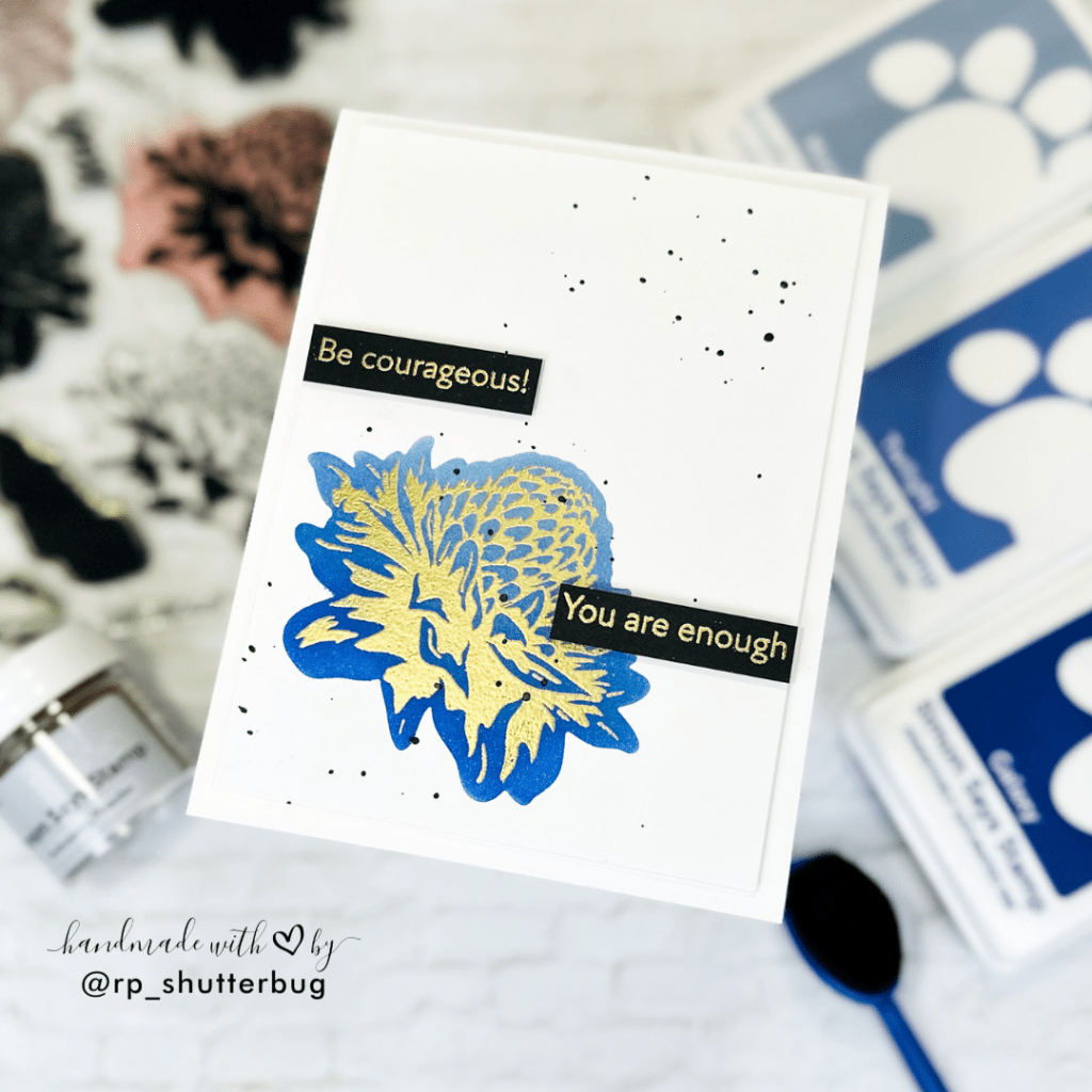
Keeping up with the clean and simple look, I created a floral masculine card. Now this was definitely a bold idea, not sure if the guys would like florals on their cards, but I wanted to try something different.
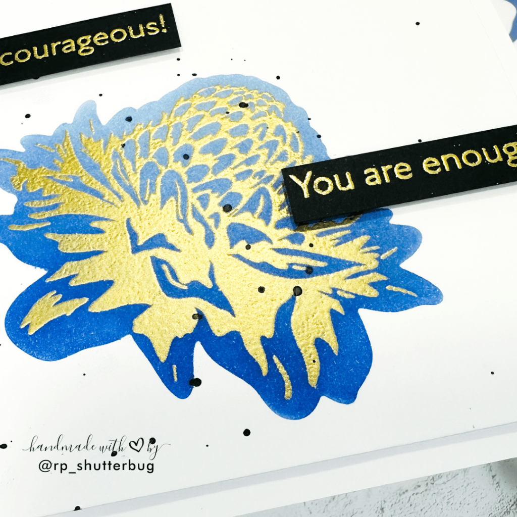
I started with this beautiful stamped image from the Build A Flower – Torch Ginger Stamp Set. This is a layering set with perfect layers to create a beautiful 3D floral image. I used the 3 layer which creates a much more intricate layers of the flowers and stamped and heat embossed it using gold embossing powder.
TIP – After I heat set the embossing powder, I allowed it to cool down for a couple of minutes before inking it up. If you don’t let the panel cool before ink blending, there are chances you might smear the embossed image.
While my panel was cooling down, I cut the floral image using the coordinating die set onto to a scrap piece of white cardstock. This created a stencil for our floral background. You could also use the solid layer of the floral image to stamp onto the heat embossed panel.
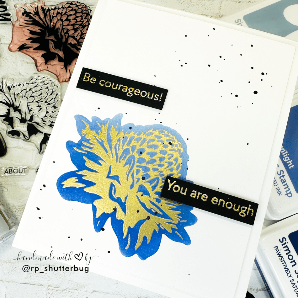
I then heat embossed the “Be Courageous” and “You are enough” sentiments from the Dainty Flowers Stamp Set onto a strip of black cardstock using the same gold embossing powder. This is something that my husband would always say to me and me to him, when we lose hope or feel low or had a rough day!
I then adhered this strips on either side of the floral focal point.
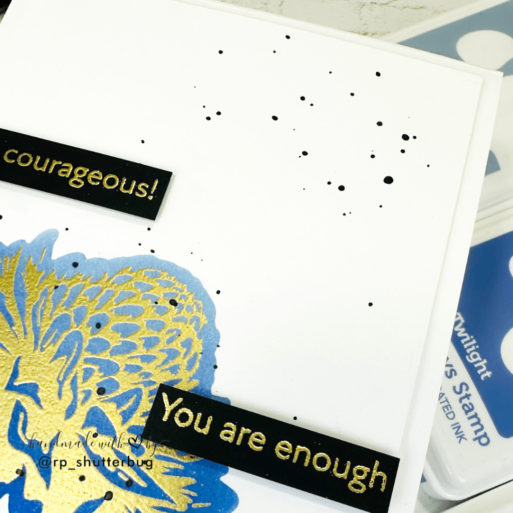
Again, I added some black watercolor splatters in the direction of or flower. This gives a flow to our focal point.
I love how easy this card was to create. One focal point with a bright vibrant color creates such a big impact on your card front.
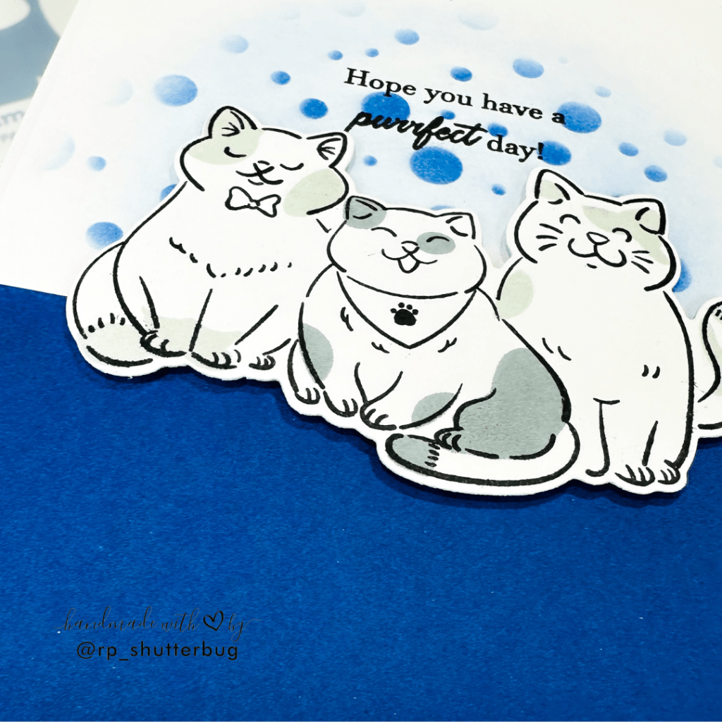
Card #3 – Birthday
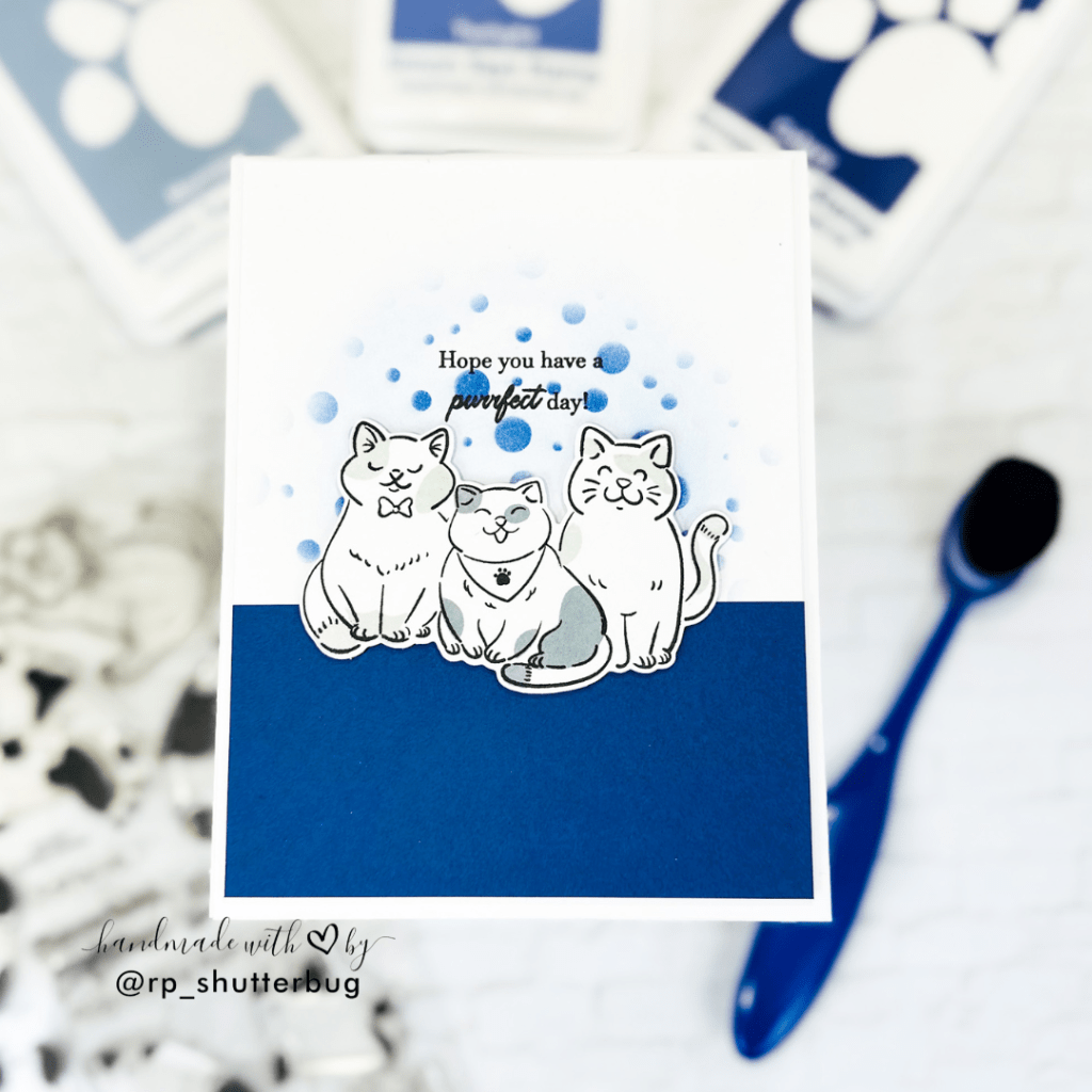
Ok, so I must confess, the Cat Life Stamp Set is my favorite in my collection. How adorable are the little kitties in this set. I have been trying to convince my dog-lover husband to become a cat lover too!
For this card, I used this trio of kitties from the Cat Life Stamp Set which is a layering set that gives beautiful details on our cats. I stamped the images using black ink and added layers with some light grays.
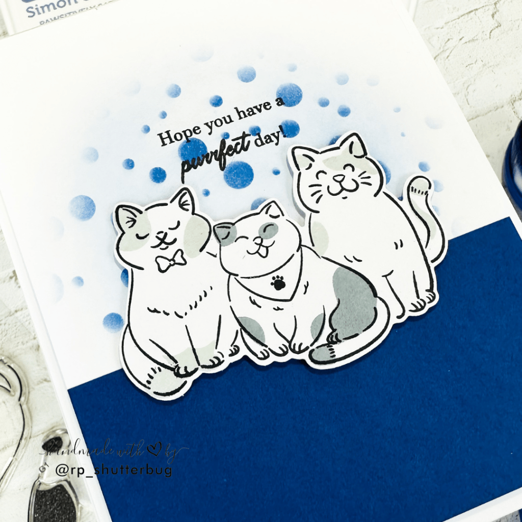
There are layering to color in the bib and the bow on our cats, but I decided to leave it as is, and not add any extra color, since I wanted to keep the color scheme fairly similar on all 4 cards. I used the coordinating die to cut out the image.
TIP – Using some scrap piece of cardstock, I cut the image 2 more times, since that gives an extra strenght to out die cut image (you do this with sentiment strips too).
For my card background, decided to add a navy blue cardstock which would ground the cats. I was initially planning to leave the background white, but later decided to add some pop of color behind our focal point. I used the same shades of blues that I used on all our cards.
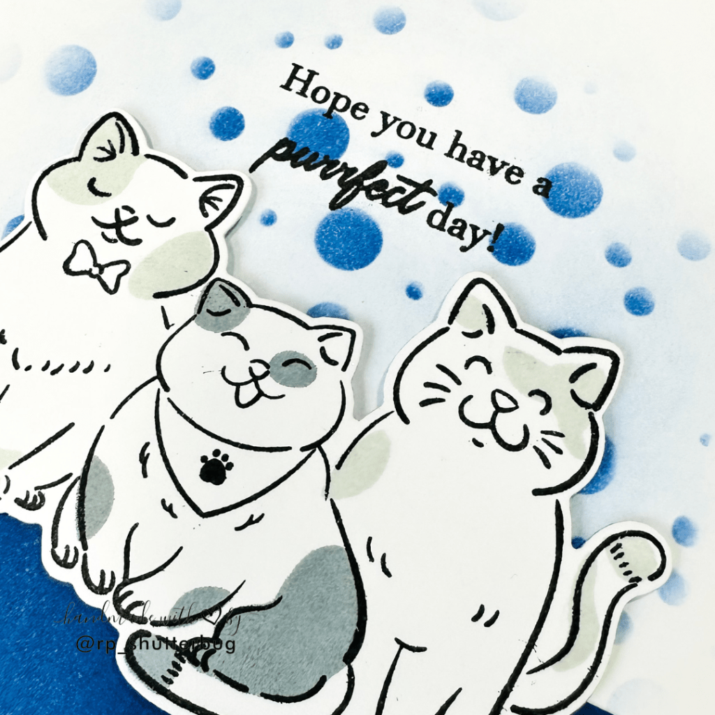
I wanted to give a confetti feel to this background, for which I used the Tiny Bubbles stencil behind the focal point image.
I stamped the “Hope you have the purrfect day” sentiment using black ink, before adhering the focal point over the card front. Even though we used 3 layers of die cuts for our cats, I love dimension on my cards, so I used foam tape to adhere it.
I cut the entire panel to be slightly smaller than a standard A2 size card base and mounted this clean and simple card front onto a side folding A2 size note card.
Card #4 – Anniversary
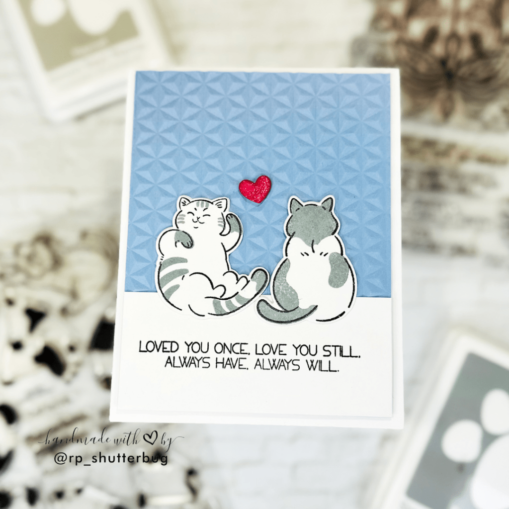
My husband and I celebrated our 8th wedding anniversary last year. We both couldn’t believe it would be a decade soon. As was looking through my supplies for an anniversary card, I came across this beautiful sentiment from the Folk Art Stamp Set which says “Loved you once, Love you still, always have, always will”. I think this sums up our love.
But if you are someone who has grown up watching the cartoon show Tom n Jerry, that’s also what we are. Total Tom n Jerry couple. We love, fight, make up, do everything together.
I had to use the Cat Life stamp with these adorable cats. I think the one giggling and looks fun is definitely my husband, and the other who is a bit grumpy right now, looking away is me.. being annoyed at his mischief! Haha.. !
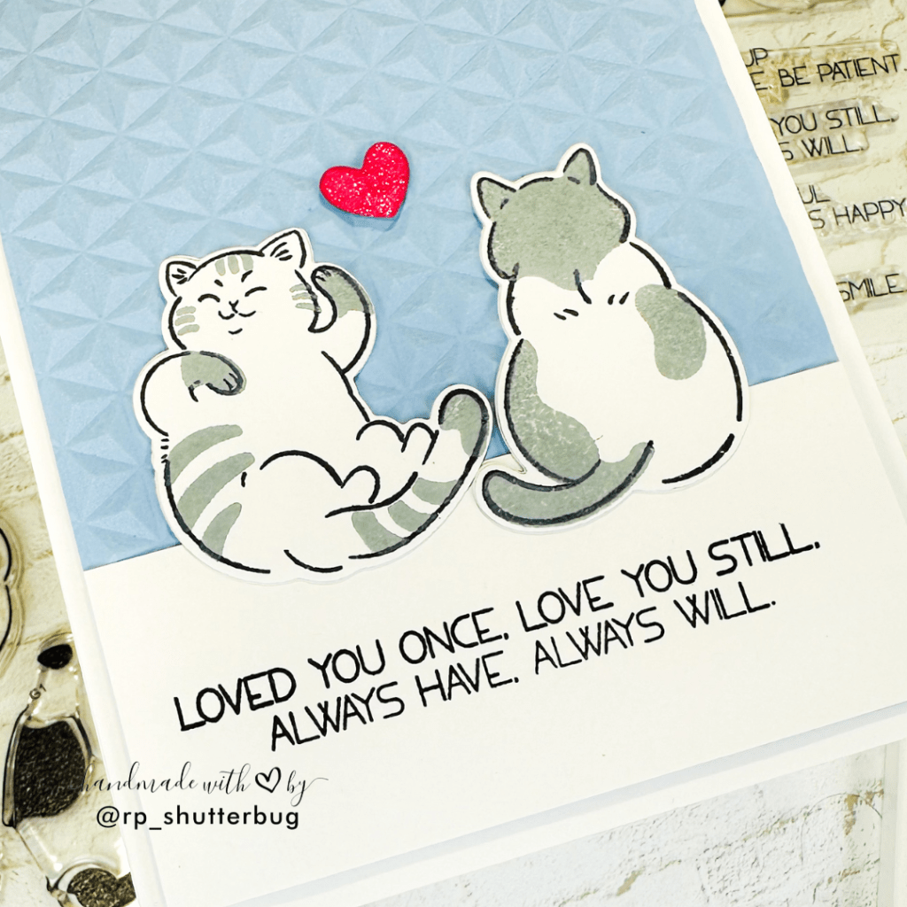
For my background I wanted a very light muted tone of blue, but with some texture. I used the 3D Diamond Stars Embossing Folder for my background. Love the texture this gives. To add some grounding to our cats, I stamped my sentiment onto a strip of white cardstock.
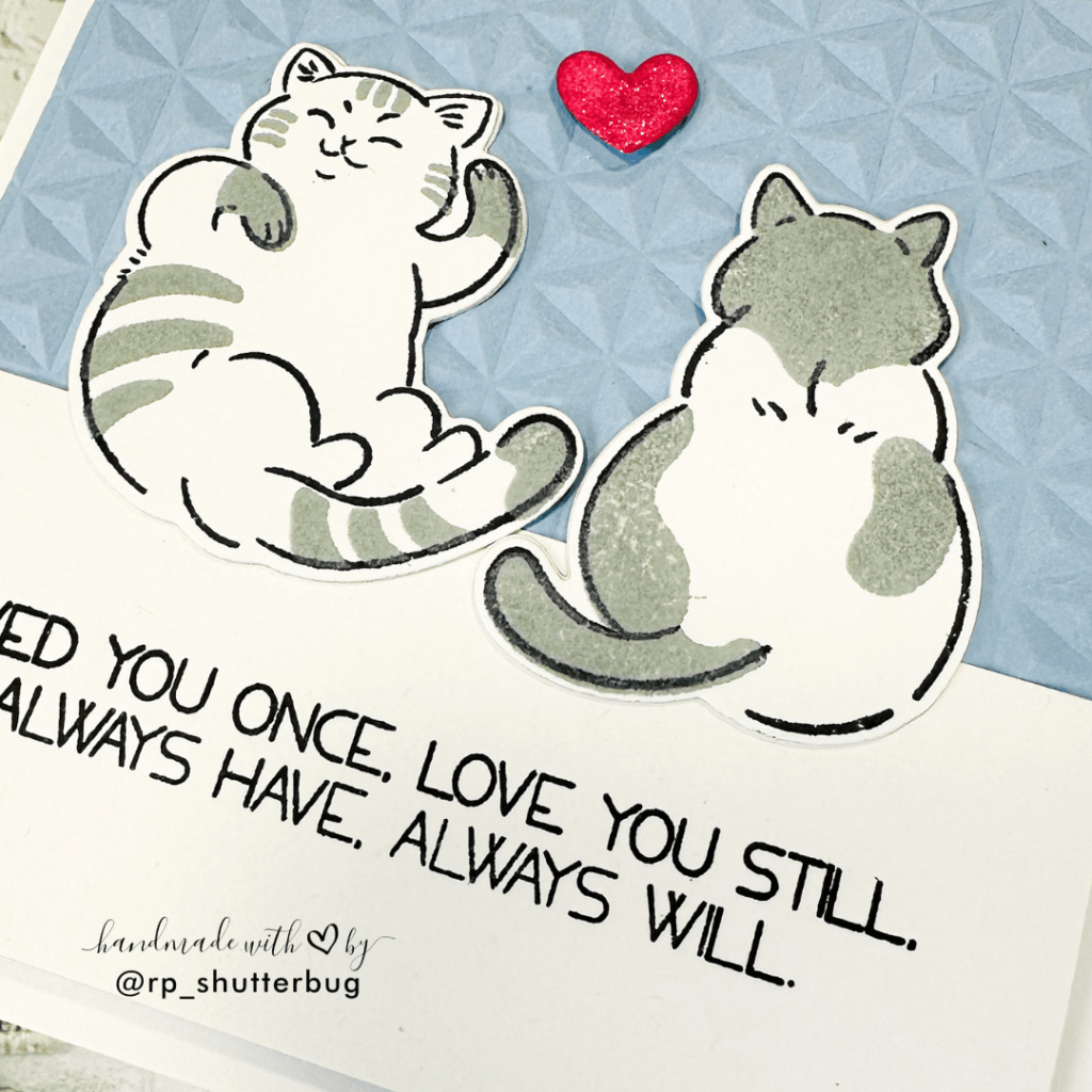
I directly adhered these images onto the embossed panel. No dimension here. Once I was satisfied with all the placements, I cut this panel to be slightly smaller than a standard A2 size card. I love the small border around my card front.

Well, I did mention that I will not be adding any other color, and will follow the color theme I had chosen for all 4 cards. But I had to add a little bright red heart ❤️
TIP – The red does add a pop of color, but does not move our eyes from the main focal point. The cats still hold the main focus and so does the color palette.
Those were the 4 cards that I created as part of my AECP Level 2 assignment. I had so much fun creating these cards and share some fun personal stories with you guys.
Watch a video tutorial –
Also, a big thank you to the creators at Altenew for all the wonderful classes and tips and tricks to create beautiful projects.
The Altenew Educator Certification Program is definitely a best opportunity to showcase my work and get in touch with all of the amazing crafters.

Thank you for being here with me today. Do check out fun pictures and videos of the project on my Instagram page (@rp_shutterbug). Also, tag me on Instagram with pictures of your projects.
Don’t forget to check out Part 2 of this assignment where I turn an old scratched and broken photo frame into a beautiful floral display piece.
SUPPLIES:
*NOTE: Affiliate links may be used (at no additional cost to you) – thank you for your support!
 https://linkdeli.com/widget.js?id=f5e8378456858c916708
Thank again for joining me today. Until next time, stay safe!


Leave a reply to Revati Panickar Cancel reply