Hello crafty friends,
Today, I’m thrilled to share a few card projects I created using watercolor techniques I learned from the incredibly talented Jaycee Gaspar. His lessons in the Botanical Illustrations Inspired Watercolor class—part of the Altenew Educator Certification Program (AECP) Level 3—were both inspiring and eye-opening.
I’ll be honest—watercoloring has always felt a bit intimidating to me. When I was browsing through the available classes for Level 3, I hesitated to choose one that focused entirely on watercolor. After much thought and research, I decided to take the leap and challenge myself. It turned out to be one of the most rewarding creative decisions I’ve made.
This class took me the longest to complete compared to my previous AECP classes, but the journey was worth every minute. While I’m still growing in this medium, I’ve gained a wealth of knowledge and confidence. Today, I’m proud to share some of the projects I created using Jaycee’s invaluable tips and techniques.
I’ve got three cards to show you, each one reflecting different aspects of what I learned. But before we dive into the details of each card, here’s a quick look at the full collection.
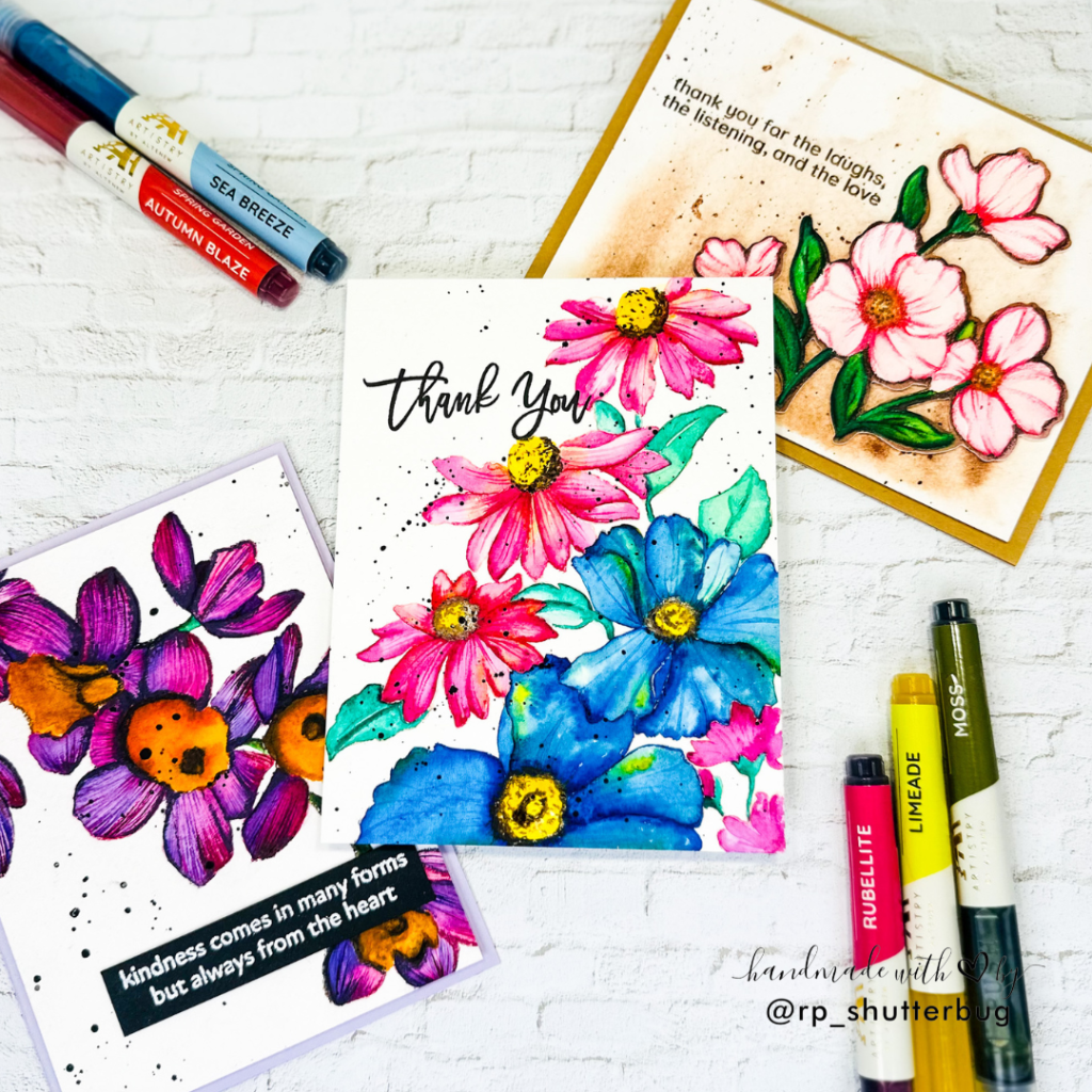
I’ll be walking you through each card in the order I created them. All three designs feature some of my most beloved Altenew stamp sets—ones I’ve collected and cherished over the years.
Card #1
Let’s begin with the first card, which features the stunning Alluring Orchid Stamp Set. I began by stamping the large, elegant floral image onto a watercolor panel using Distress Ink in Tattered Rose. The soft, barely-there outline served as a perfect guide for a no-line watercolor technique, offering just enough detail to define the shapes without overpowering the delicate watercolor look.
For the color palette, I turned to my favorite floral combination—pinks and purples. I used Rubellite and Midnight Violet from Altenew’s Spring Garden Watercolor Brush Marker Set. Starting with the lighter pink, I painted alternating petals to allow drying time in between, using my heat tool to speed up the process and avoid colors blending unintentionally. I gradually built up the depth, concentrating pigment near the center of the flower and along the shadowed areas for dimension.
The flower centers were painted with a mix of Warm Sunshine, Autumn Blaze, and Evening Gray, creating a warm contrast that draws the eye inward. I experimented with both wet-on-wet and wet-on-dry techniques throughout, adding in fine detail with a thin brush to create natural-looking petal texture.
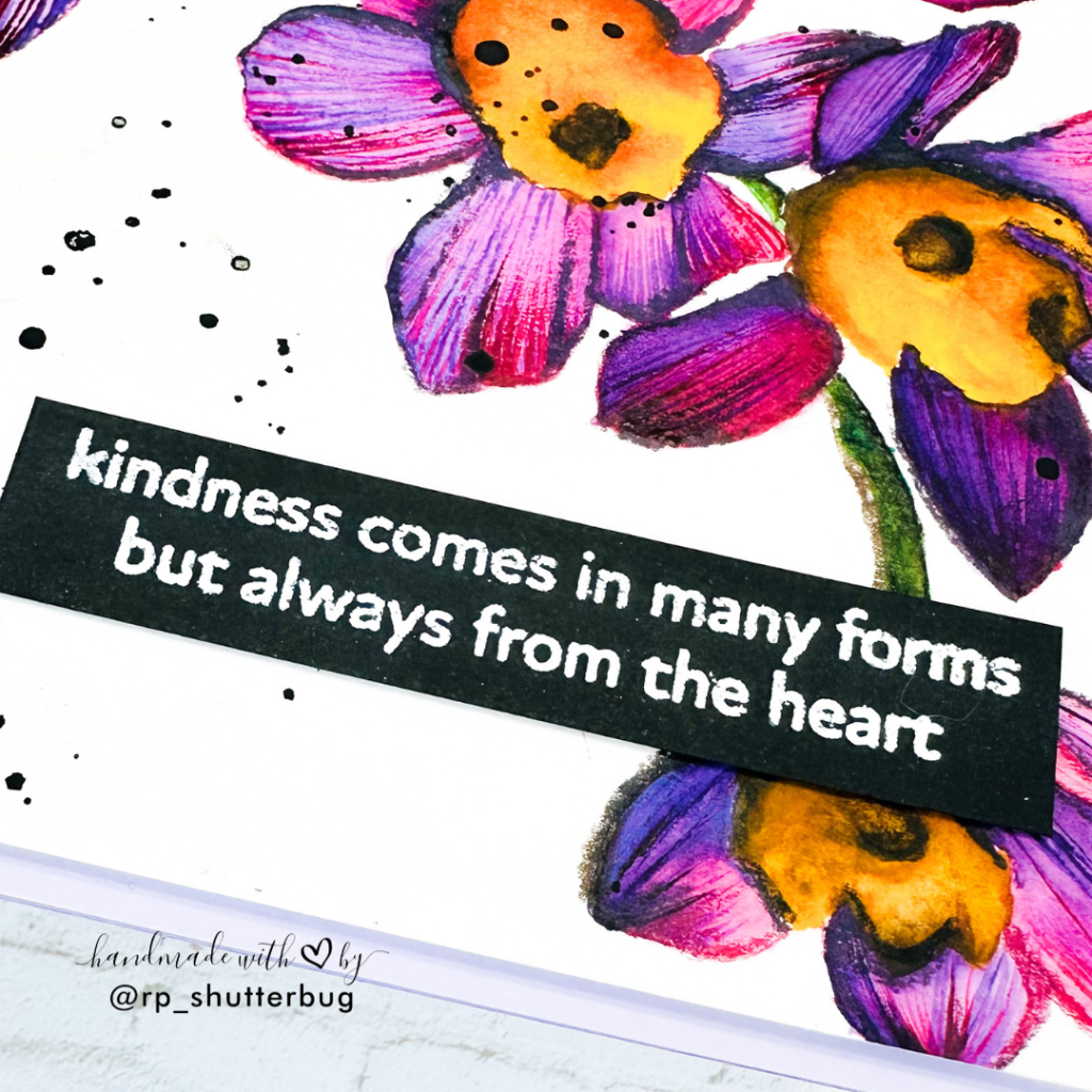
Instead of stamping the sentiment directly onto the painted panel, I opted for a separate sentiment strip, choosing a lovely phrase from the same stamp set. I heat-embossed it in white on black cardstock for a bold pop.
The panel was trimmed to 4″ x 5¼” and mounted onto a Lavender Fields cardstock base—subtle yet beautifully complementary.
This card marked my very first attempt at botanical-style no-line watercoloring, and though I approached it with uncertainty, I’m genuinely pleased with how it turned out. In fact, I’ve already started recreating the same design using different color combinations!
Card #2
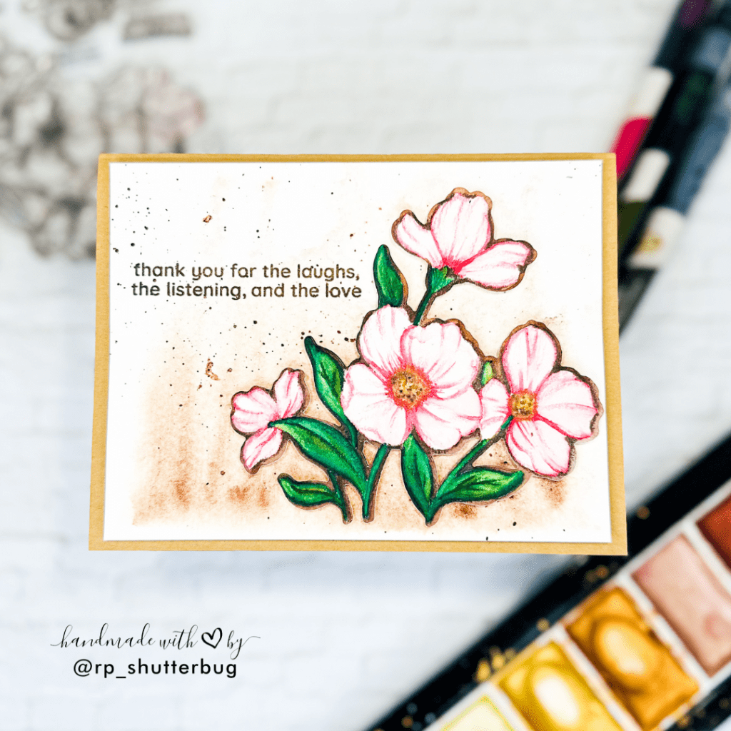
For my second card, I chose a smaller floral image from the Build-A-Garden: Nature’s Magic Stamp Set. Just like the previous card, I stamped the image using Distress Ink in Tattered Rose—a soft, subtle ink that’s perfect for no-line watercoloring.
This time, I wanted to challenge myself further by sticking to a monochromatic look. I selected a very light pink watercolor and focused on building softness and detail through careful layering. Using a clean, damp brush, I first moistened each petal individually. Then, with just a touch of color on my brush, I added pigment to the petal edges, allowing it to gently diffuse. This helped create natural-looking shadows and depth.
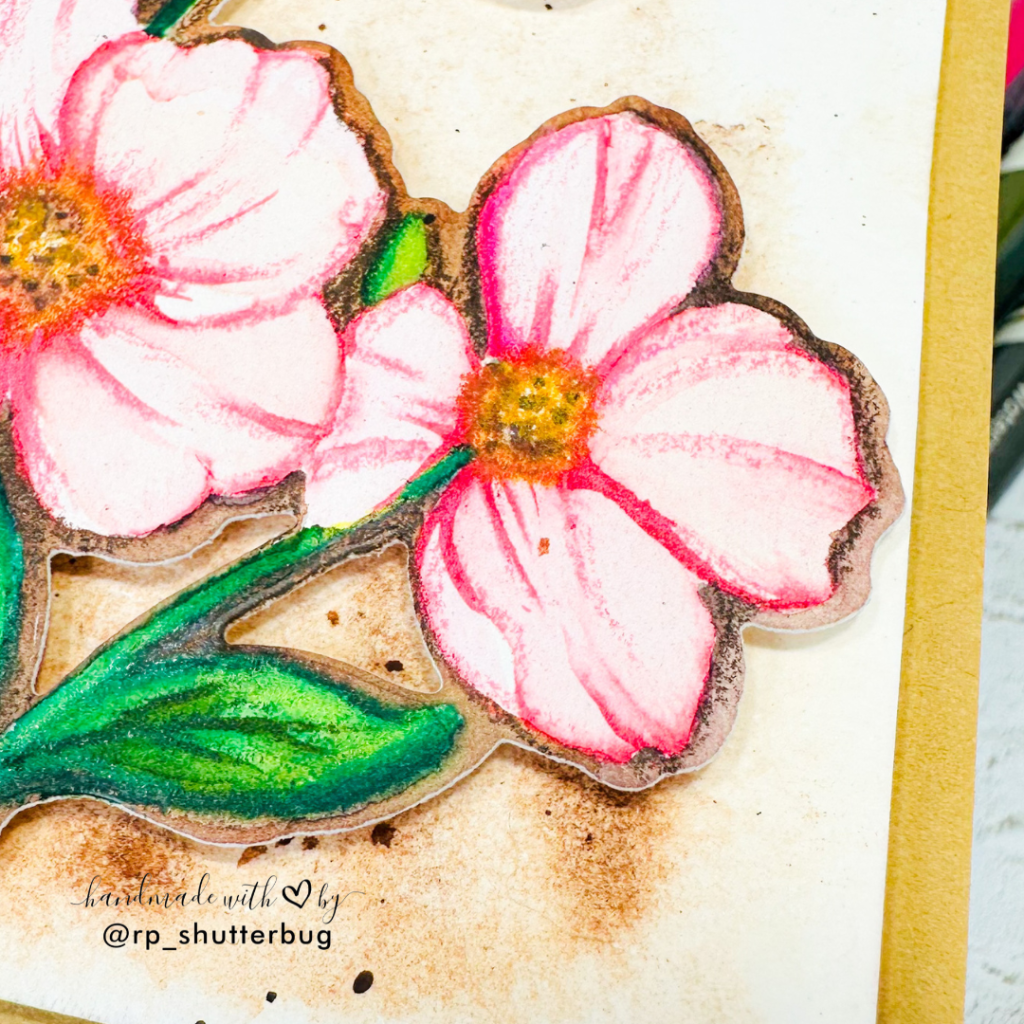
To give more dimension and realism, I added fine lines to mimic the grooves and ridges you often see on petals. In some areas, I used a color-lifting technique—gently dabbing a clean, dry brush over darker spots to lift excess pigment and create lighter highlights.
For the leaves, I used a harmonious mix of yellows and greens, with touches of brown in the mid-sections to deepen the shadows and add a more organic feel.
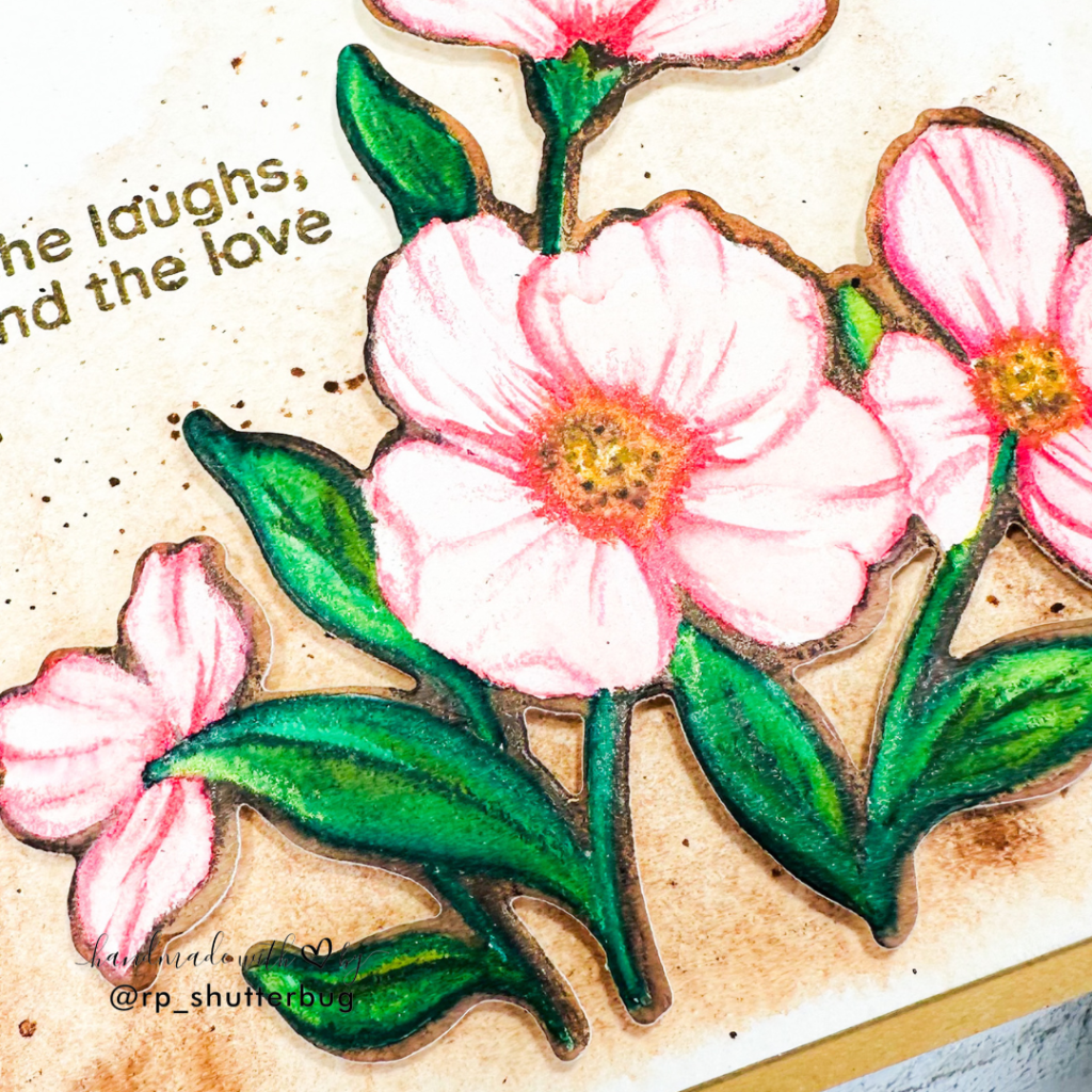
Rather than keeping the floral element on the original panel, I decided to die-cut the image and set it against a unique, textured background. To create the background, I sprayed a watercolor panel with clean water, propped it upright, and added a warm brown watercolor to the top edge. Letting the pigment naturally drip down created a beautiful cascading effect, adding visual interest and movement.
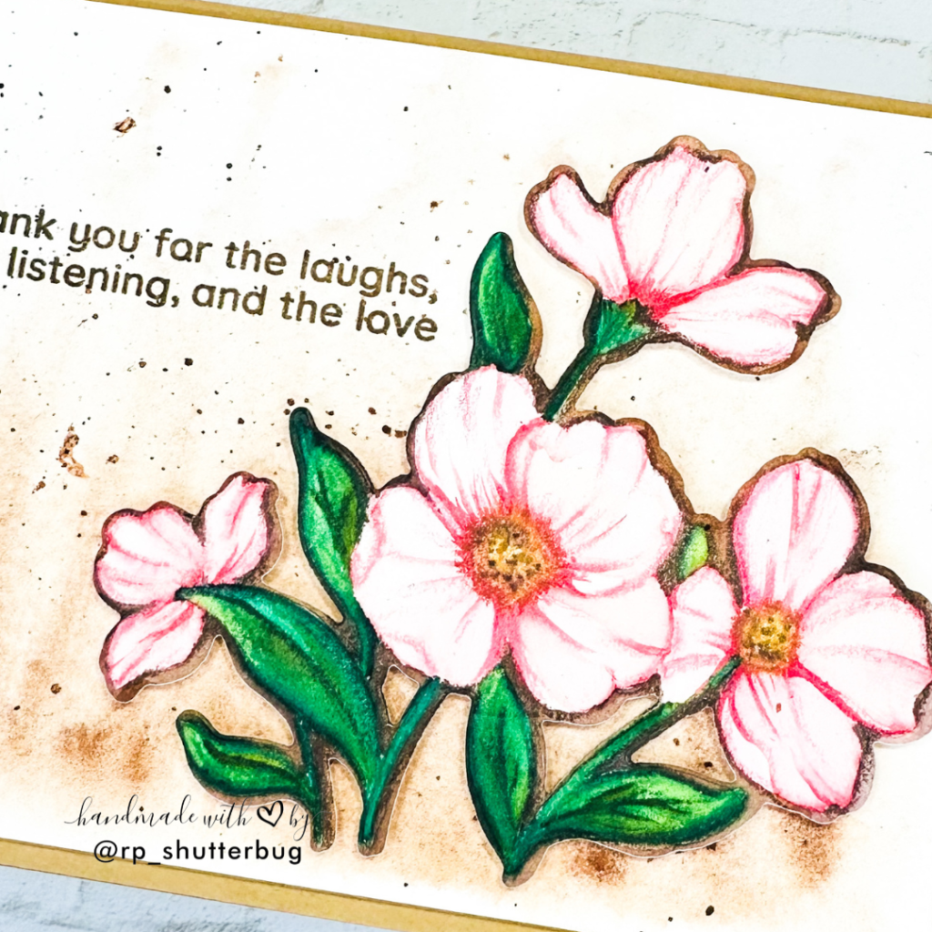
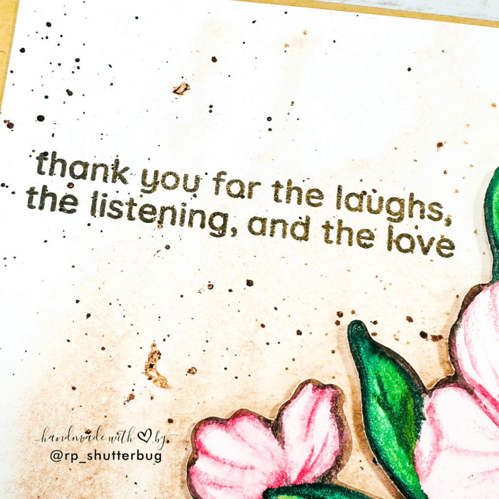
Before adhering the floral element, I stamped a sentiment from the Magnificent Magnolias Stamp Set using brown pigment ink, echoing the tones in the background. A few brown watercolor splatters completed the look, tying the entire design together.
This card feels soft, warm, and a bit more artistic in its composition—a fun experiment with both color control and creative backgrounds!
Card #3
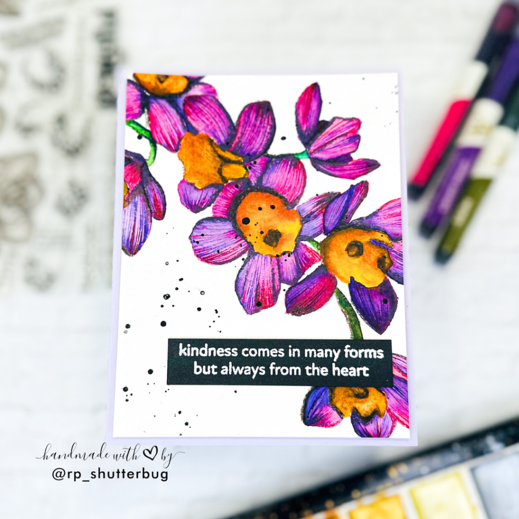
This card is hands down my personal favorite from the collection. The vibrant color palette truly brings the florals to life, and I found myself smiling throughout the entire process of creating it.
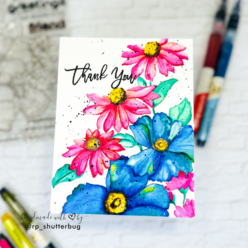
I used the large floral cluster from one of my all-time favorite sets—Flourishing Garden Stamp Set—stamped again in Tattered Rose Distress Ink for that soft no-line watercolor base. What made this image a bit more challenging (and exciting) was that it included two distinct types of flowers, which I thought would look stunning in completely different color schemes.
I chose a combination of pinks and yellows for the smaller florals, and went bold with vibrant blues for the larger blooms—definitely a color I don’t typically use for flowers, but I absolutely loved the unexpected contrast it brought.

Starting with the pink flowers, I worked on alternate petals to allow drying time between layers. I first applied clean water, then added a blend of pink and a touch of yellow, concentrating the pink toward the base of each petal. While the area was still damp, I gently lifted some color with a dry brush to create soft highlights. I deepened the shadows in areas where the light would naturally be less prominent—a key takeaway from Jaycee’s lessons.
For the blue flowers, I followed the same process—wetting the petals, then applying a bright, saturated blue. I added hints of yellow in certain spots, allowing the colors to blend slightly into subtle green tones, which added a beautiful organic effect. This intentional blending really brought a dynamic feel to the overall look.
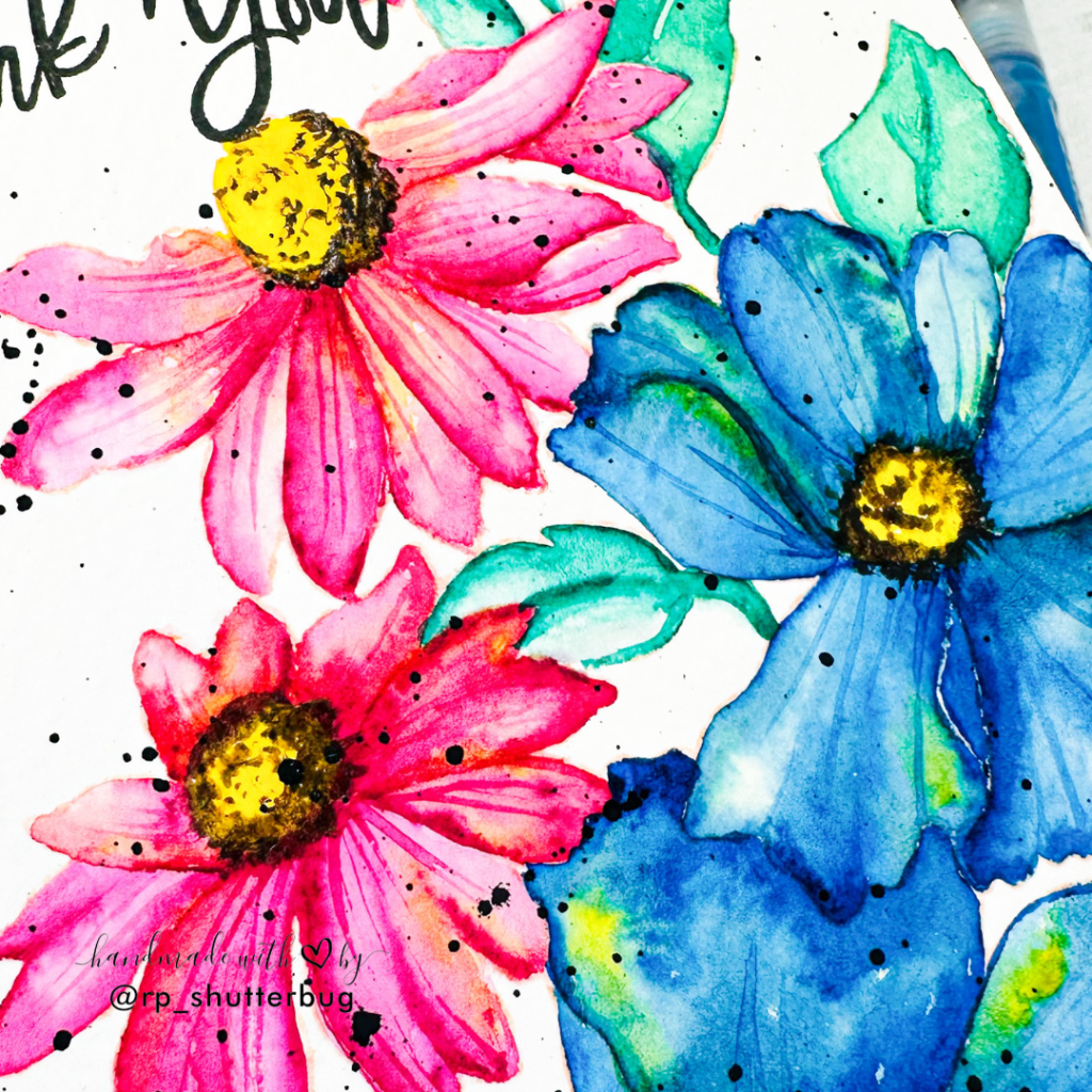
I kept the leaves and stems simple, using just one shade of green. I varied the intensity to give depth, and used some color lifting to create natural highlights down the center of the leaves.
For the flower centers, I painted them with a bold yellow, then added soft brown flicks around the edges to mimic the appearance of stamens and pollen clusters. This little detail gave the flowers a touch of realism.
Once all the base coloring was complete, I went back in with the original pink and blue tones, using a fine brush to add delicate detail lines to the petals—resembling the natural veins and texture you often find in real flowers.

After allowing the panel to fully dry, I stamped a sentiment from the Magnificent Magnolias Stamp Set. The elegant font paired beautifully with the detailed floral illustration. To finish it off, I masked the sentiment and added black watercolor splatters across the background for extra texture and visual interest.
I absolutely love how this panel came together. The colors, the details, the boldness—it’s a piece I’m truly proud of. I mounted it onto a top-folding A2 white card base to let the artwork take center stage.
This watercolor journey has been one of the most rewarding experiences in my creative path so far. Each of the three cards I shared—whether it was the soft elegance of the Alluring Orchid, the delicate tones paired with a textured background in Nature’s Magic, or the vibrant contrast of the Flourishing Garden—represents not only what I learned technically, but also how much I grew in confidence as an artist.
When I first started this class, I was honestly nervous about diving into an area of cardmaking that had always felt a bit intimidating. Watercolor requires a level of trust—in the medium, in the process, and most importantly, in yourself. And while I still don’t feel like I’ve mastered it 100%, I can confidently say that I’m proud of what I’ve created and excited to keep learning and growing.
I want to note that each of these projects took me a minimum of 4–5 attempts to get to a place I was happy with. There were many moments of frustration, but I reminded myself that it’s all part of the learning curve. What stood out to me the most from Jaycee’s class was his emphasis on observation, patience, and layering with intention—and that’s exactly what helped me push through.
A special thank you goes to my wonderful husband, who generously took over toddler duty so I could spend uninterrupted time working on these cards. His support made it possible for me to truly focus, experiment, and enjoy the process.
If you’re someone who’s hesitant to try watercolor like I was, I hope this post gives you a little encouragement to take that leap. Embrace the imperfections, celebrate the progress, and above all—have fun with the process.
I can’t wait to keep exploring this medium further, and I look forward to sharing more watercolor projects with you soon.
A huge thanks to Jaycee for sharing all the fun lessons and amazing tips. The Altenew Educator Certification Program is definitely a best opportunity to showcase my work and get in touch with all of the amazing crafters.

Thank you for being here with me today. Do check out fun pictures and videos of the project on my Instagram page (@rp_shutterbug). Also, tag me on Instagram with pictures of your projects.
SUPPLIES:
*NOTE: Affiliate links may be used (at no additional cost to you) – thank you for your support!
 https://linkdeli.com/widget.js?id=f5e8378456858c916708
Thank you again for joining me today. Until next time, stay safe.


Leave a reply to thisisme Cancel reply